Every Component
DESIGN SYSTEM
2024
OVERVIEW
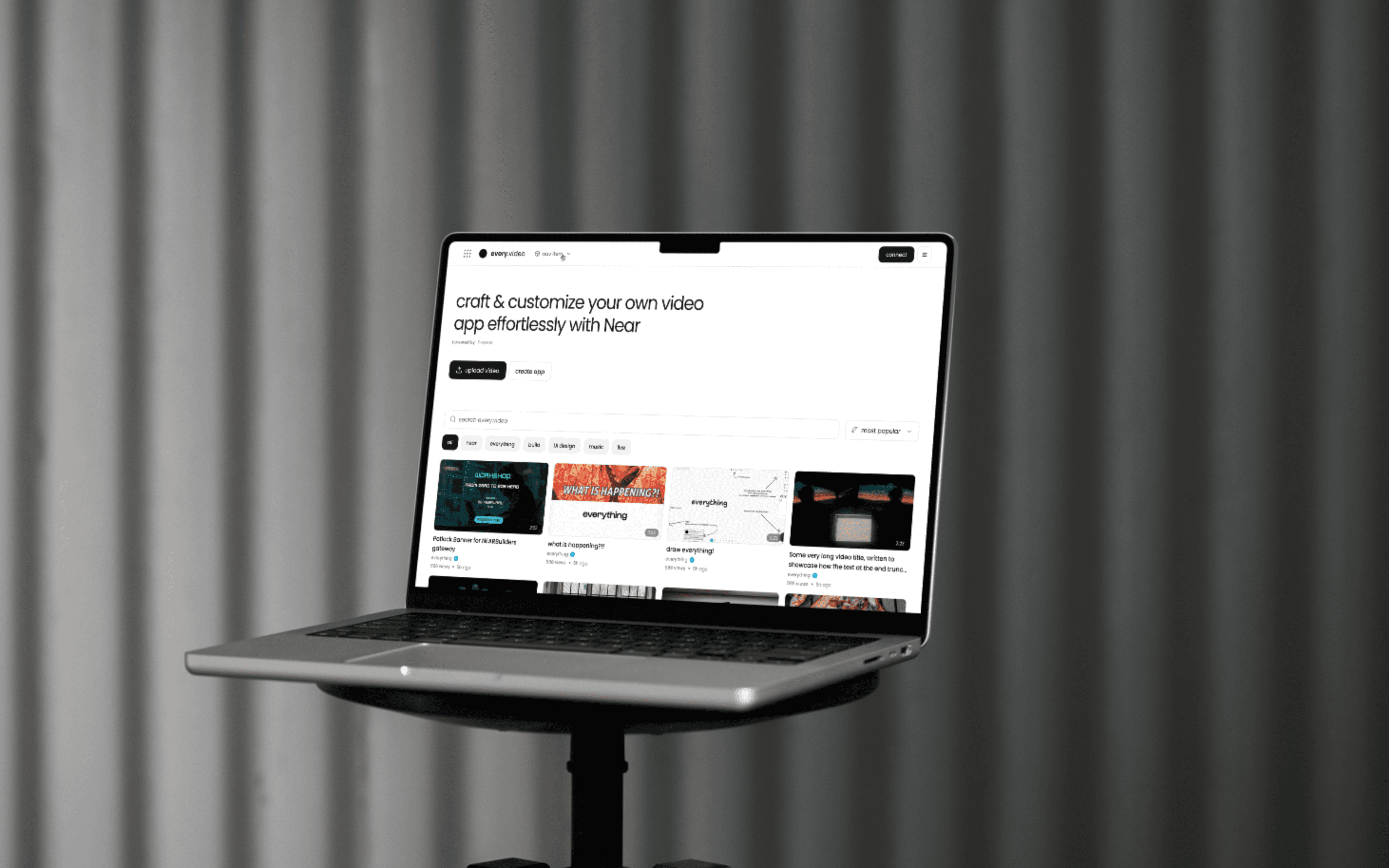
Create a minimalistic and easy-to-use design system in Figma that could be utilized across multiple applications within the Everything.dev ecosystem. This design system aims to assist developer teams in building new applications more efficiently, eliminating design-related hassles.
TEAM
Marie Dyachenko – Design
CHALLENGE
One of the main challenges faced was creating components that are convenient for users who may not be proficient in design. The focus was on simplicity, usability and comprehensive documentation.

FOUNDATION
The design system includes foundational elements such as color palette, typography styles and layout grids, with more elements to come as the project progresses: shadows & effects, layout templates.

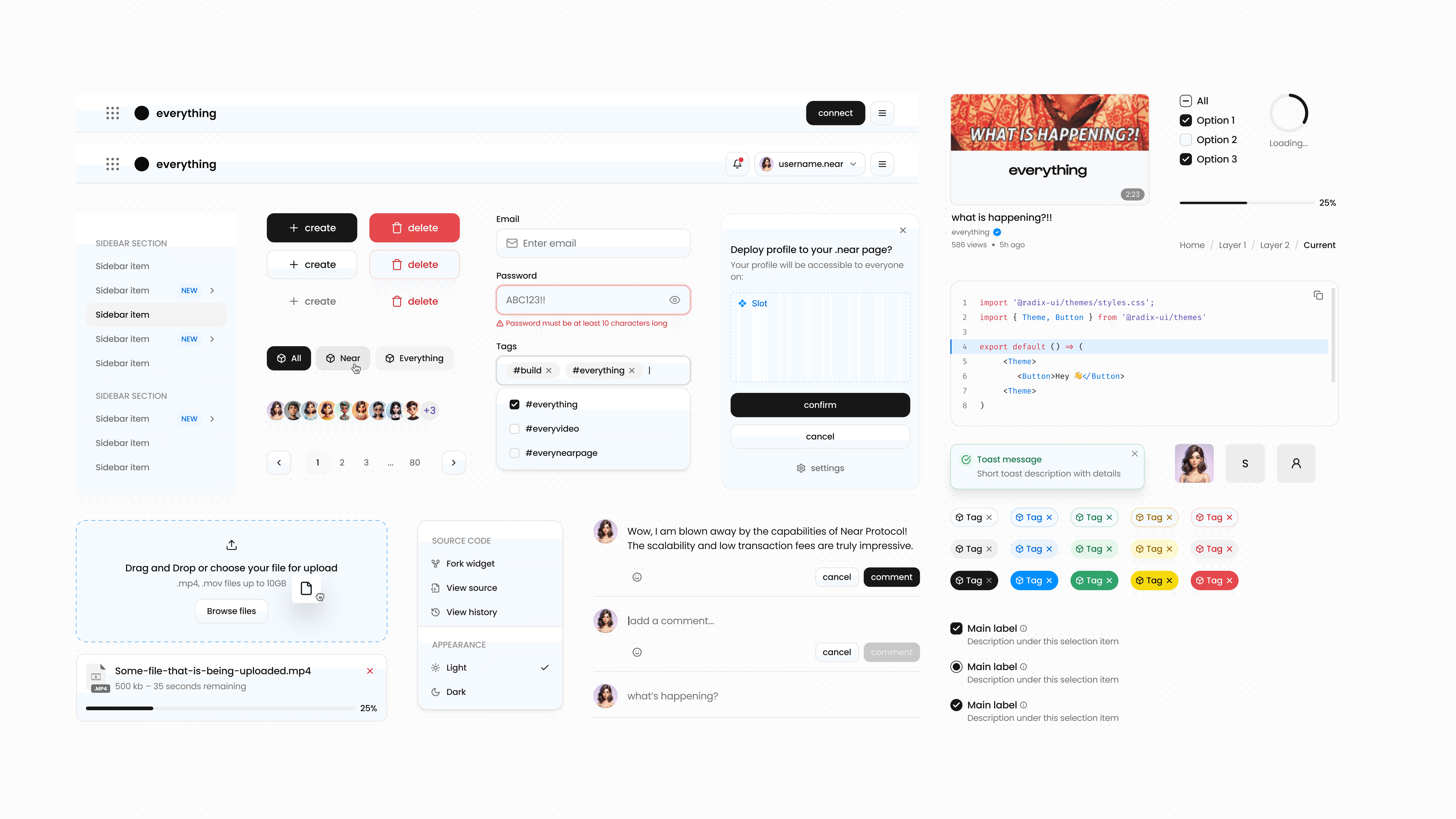
COMPONENTS
We leveraged Figma's component features, like variants and boolean properties to create components that are scalable, adaptable, and would fit multiple use cases.
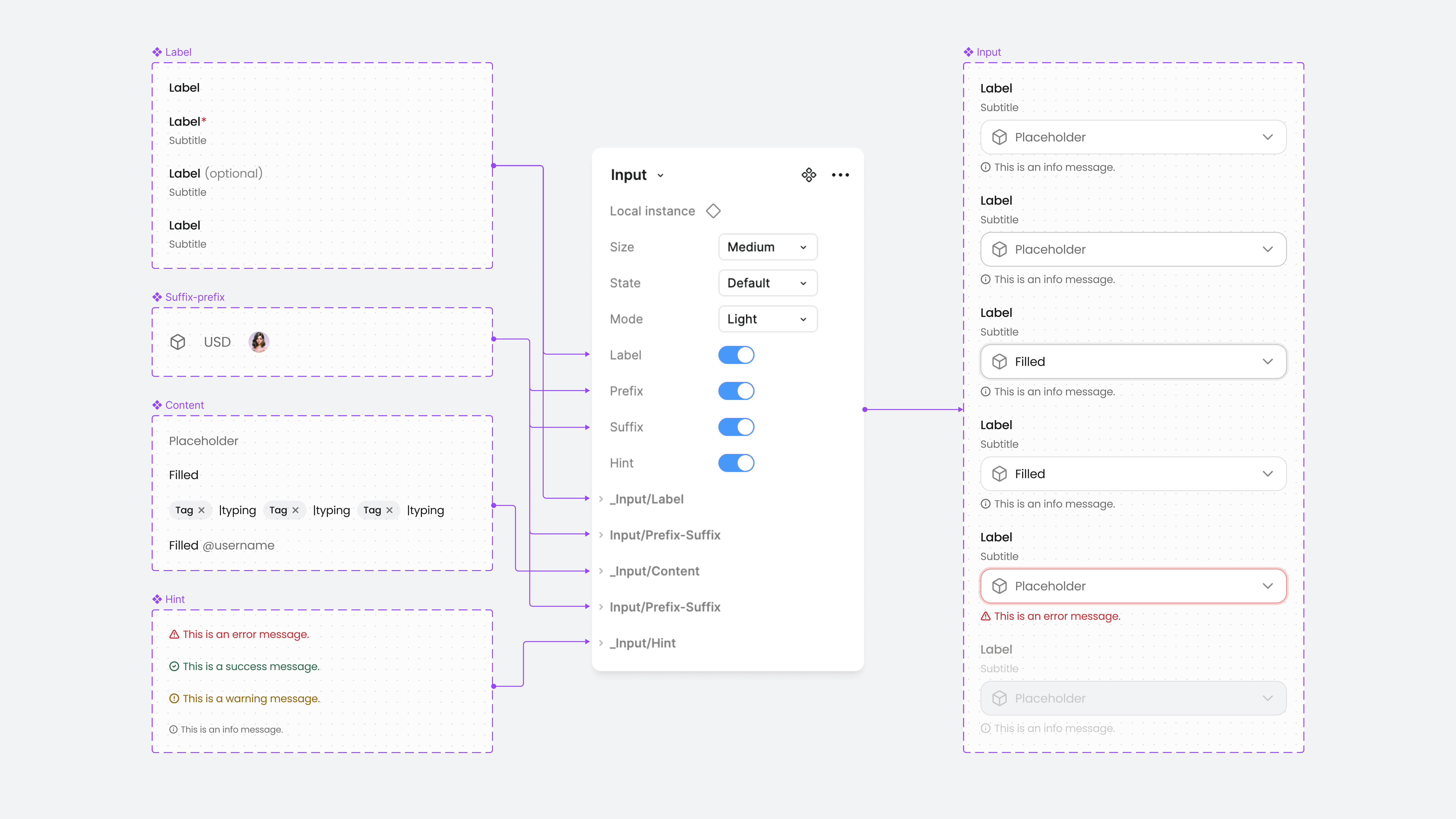

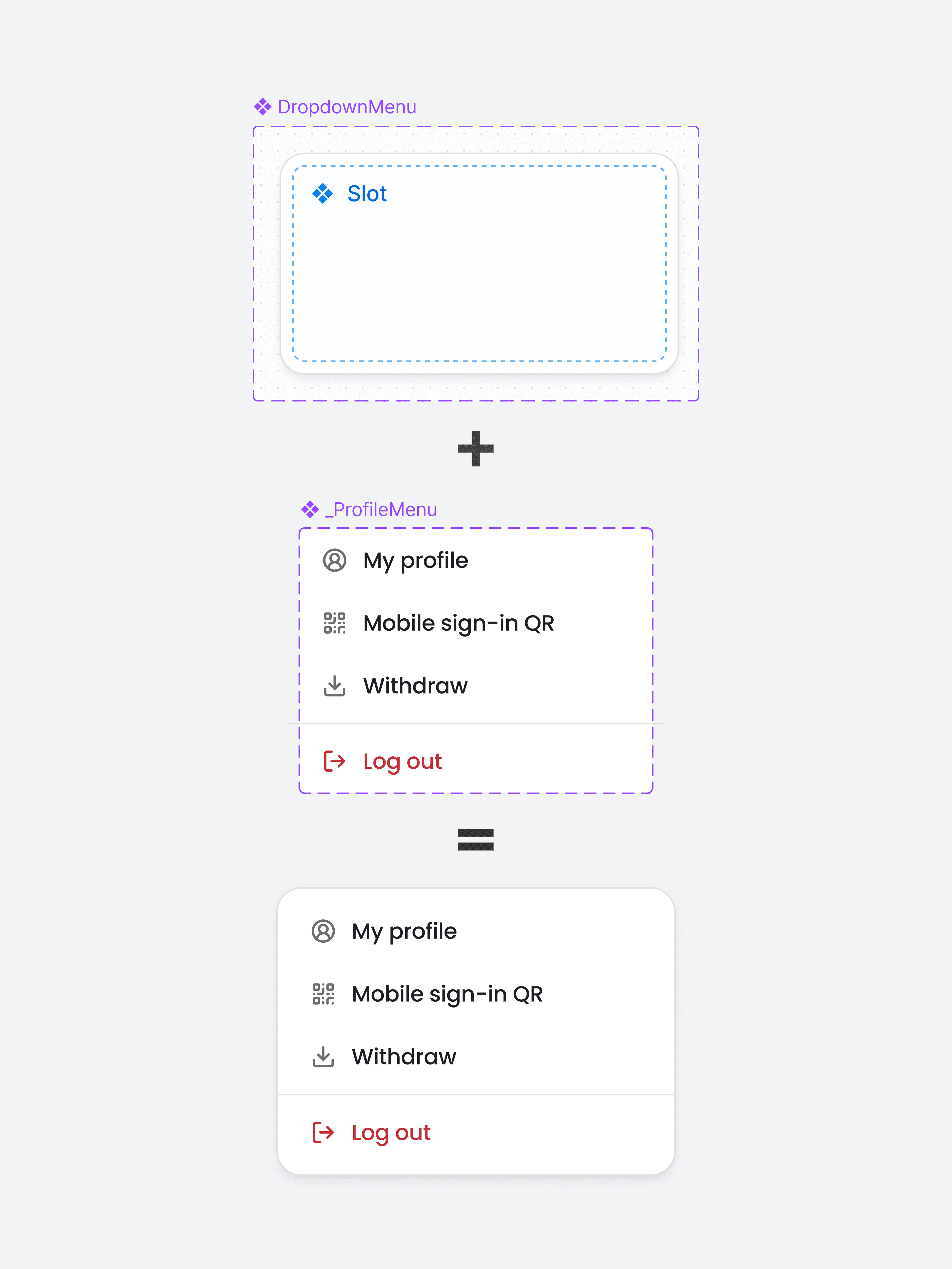
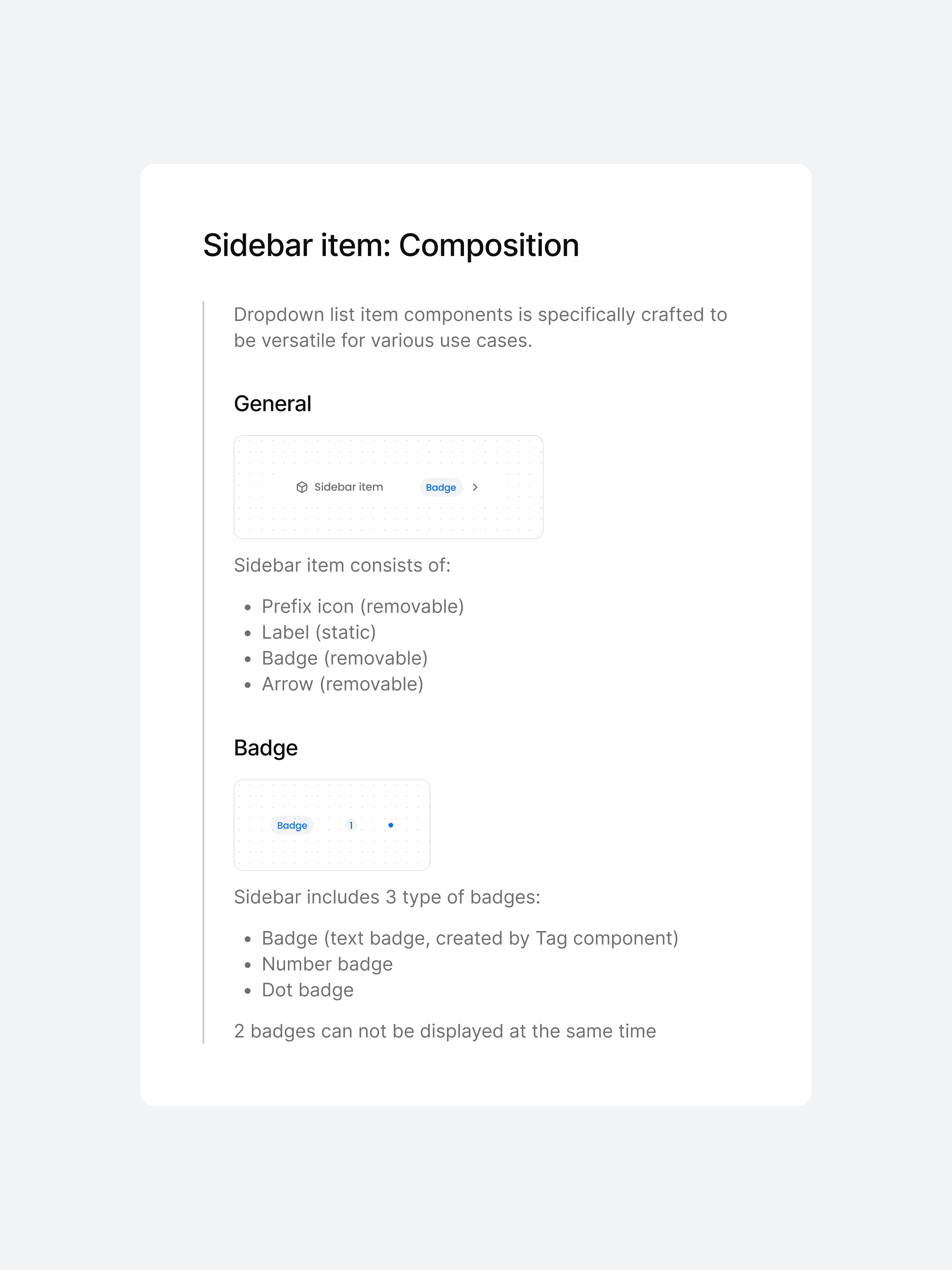
SLOT
Some components, like Dropdown Menu, utilize Slot component to keep it flexible. Create a local component of your list and replace Slot with it. Easily make changes to the menu list, add or remove items without detaching any of the main components.
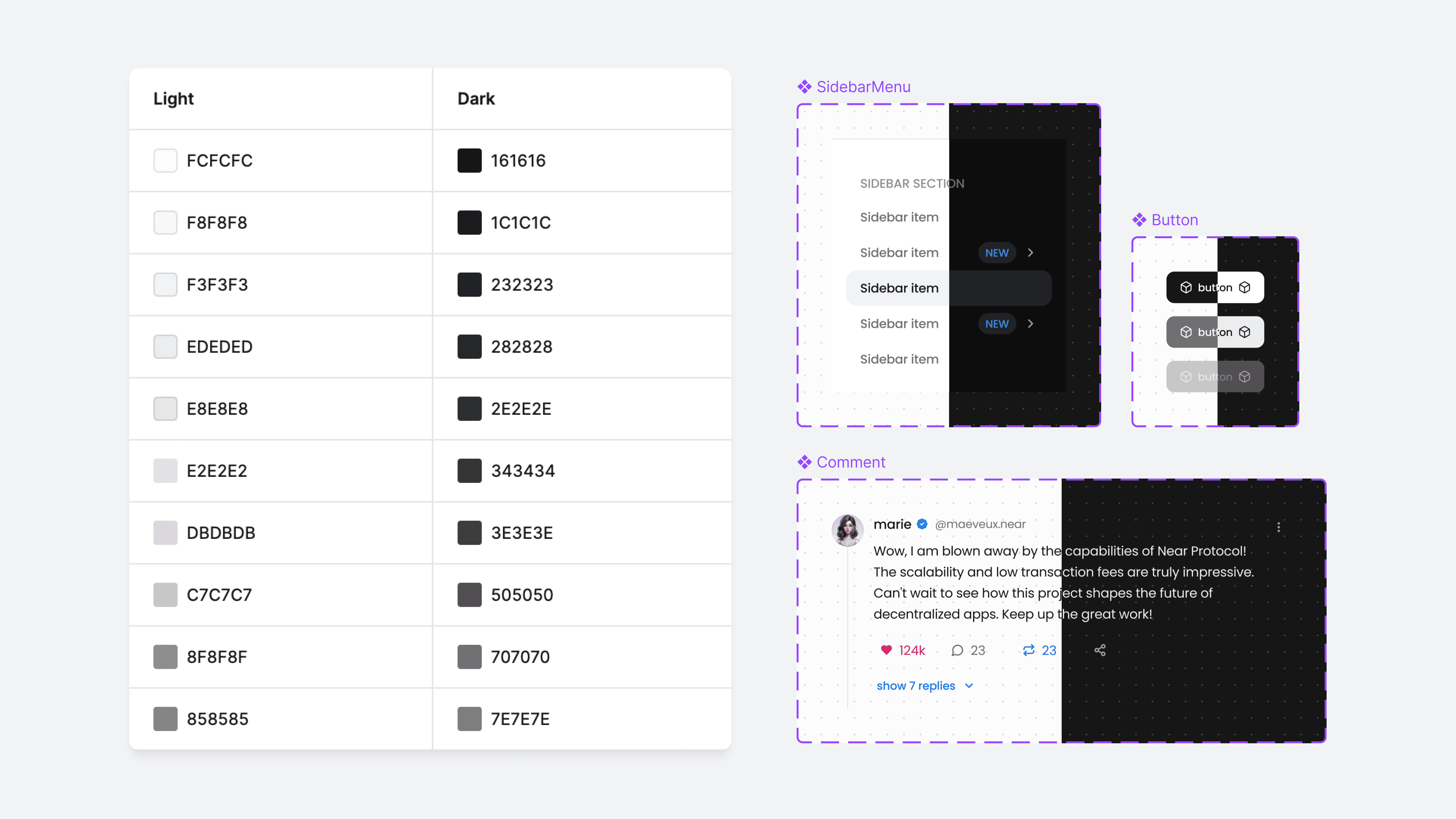
MODES
Setting up a collection of variable colors with 2 modes made it easy to switch between light and dark modes.
GUIDELINES
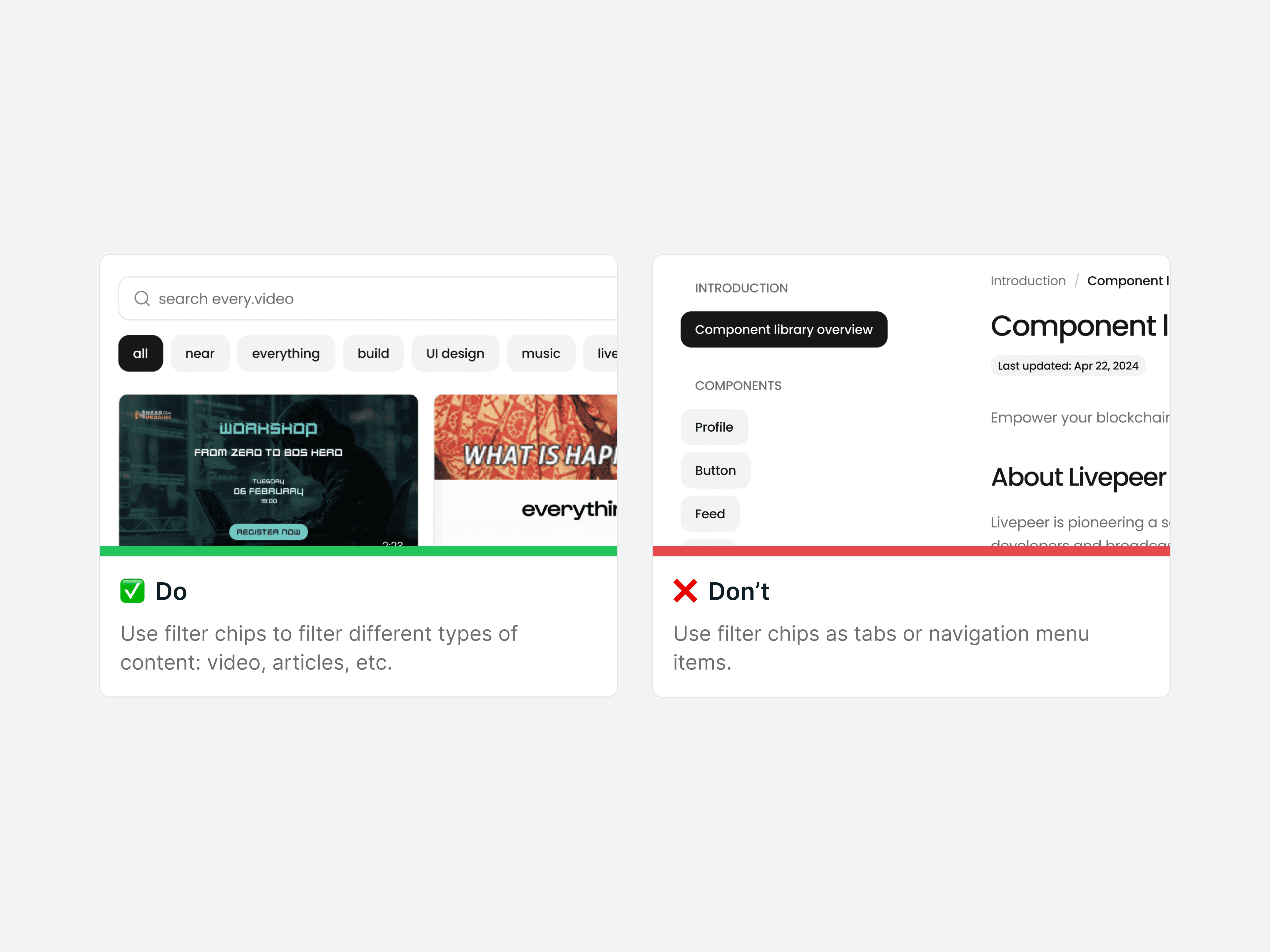
Each component comes with detailed usage guidelines, outlining its structure and providing illustrated examples to ensure proper usage. These guidelines help maintain consistency and usability across all applications.
PROGRESS
So far, 37 essential components were created, with more to go. We're going to test it in various use cases and improve based on designers' and developers' feedback.
Really incredible work: super organized and always coming up with great ideas. A pleasure to work with.


Elliot Braem
Everything


